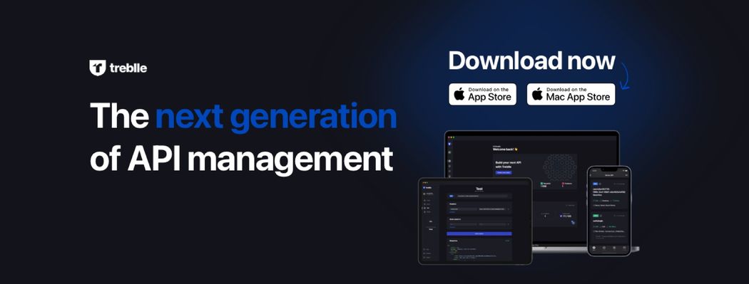
Hi everyone, I'm Tea, mobile lead here at Treblle and I'm here to tell you a story about our newly released native, all in one app, for your iPhone, iPad and Mac. This is my first time writing an article so fingers crossed you all like it 🤞🏻. I'm here to tell you a story of how we built our all in one Treblle app for iPhone, iPad and Mac. I'll try to cover some technical details but also guide you to the thought processes and design iterations we went through.
The story of building this app is a lot longer than you might think 😀 but not because it's that complicated but rather because we've changed the vision around it many many times. The origins of the app actually date back all the way to 2020.. Vedran, Darko and I were still working at our previous company on a lot of different APIs and mobile apps. Just like any other development company we didn't have a lot of time to spare. But we did like working on Treblle so we tried to do it whenever we had even a millisecond of free time. We all liked the product because we were building it for ourselves and it was helping us every single day. Like, I remember the days when I would get stuck with an API because I had to wait for Vedran to finish a call and explain why my API requests were not coming through. But then after we started using one of the earliest versions of Treblle I didn't need to depend on him as much. I would use Treblle while I was making API requests from the iOS apps just to make sure the data was coming in the way it needed to. I could essentially self-service my needs as an iOS developer just with Treblle, everything from debugging, access to documentation to seeing the requests and what others are doing.
So in light of that we wanted to build something we would use, for ourselves. This is how that journey looked like.
Version 1
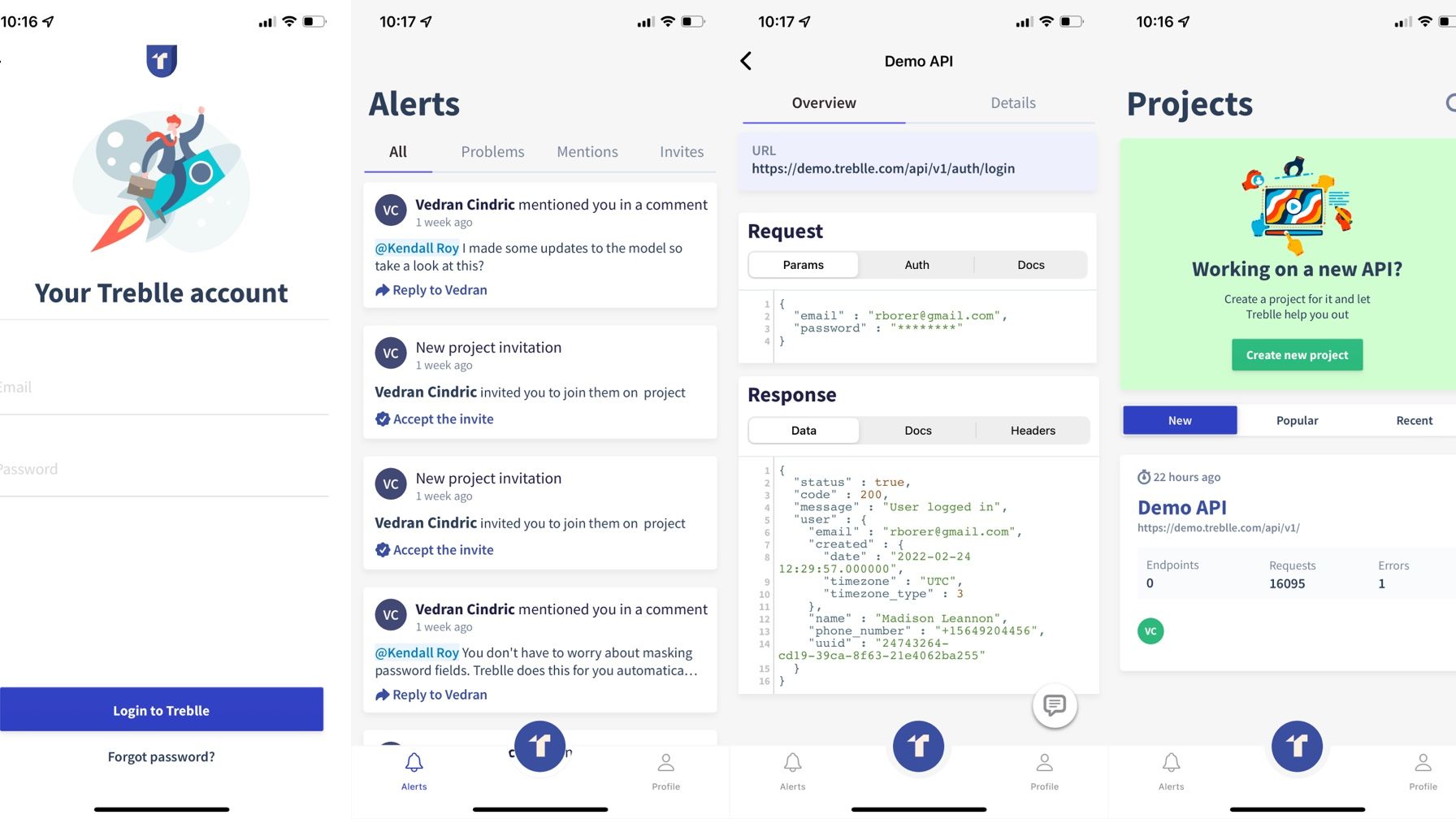
We of course started working on the web side of things first. But early on Vedran has said that he needs and wants this to be an app. At that time he had literally one reason for it - push notifications 😂. He always said that he'd like to get a push notification whenever something goes wrong directly on his phone before anyone else. That way he could fix the problem before anyone notices 😄. So after we made the initial version of our platform we started working on an iOS only app for it.
The very first version we were building was an app with literally 6 screens. The login/register, dashboard, alerts, profile, single project screen and a view of one of the requests. That was it. We didn't even have the content for the profile screen like we didn't even know what to put there. The main priority was getting a list of alerts and being able to view a request on the phone. Darko made me a couple of designs that were almost a clone copy of the website in responsive mode 😉
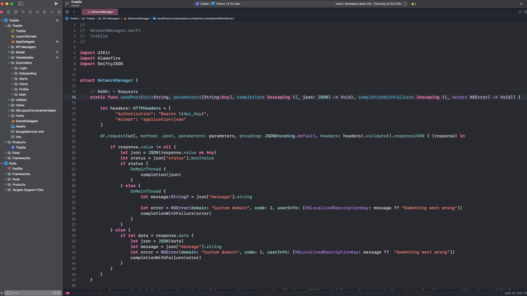
For this version of the app I used Swift. I did start developing while Objective C was still a thing but I'm actually a huge fan of Swift. The language simply suited me more. At that time M1 Macs were still not a thing and I had a 128GB Macbook Pro which would run out of hard disk space every 2 days especially if there was an Xcode update. It was horrendous. So developing wasn't fun because something would constantly break, lag or be slow. My initial plan for the app was to keep it as simple as possible. Just like with any other app I used the MVVM architecture. I quite like the approach, the cleanness of it and the separation of everything graphical with everything business and model related. A typical structure for me would look like something like this:
We also didn't use that many pods which was a bit unusual because on previous projects there would be like 3 analytics pods, 2 UI pods and the rest....Vedran was always adamant about this and would always say that we don't need a fancy app, we don't need animations, we don't need anything for version 1. Let's just make it work. I started working on it and within a few weeks we had a version that was up and running. It was far from perfect but it worked. It was actually summer time when we finished it and I remember Vedran begging me to push it to TestFlight so he can get push notifications. I was trying to argue that the app isn't fully finished and he wouldn't be able to do a lot but he was adamant and only said: "Push notifications". 🤣 So I uploaded the first built and I remember we were somewhere, out and about, and we all get a push notification for the first time. "Project XYZ is having some problems" and the description of the problem. And he looks at his phone and says: "See now I know this isn't actually a big deal but they will call me to ask why this isn't working and I'll already know what's wrong so we don't have to go back and get my Macbook". That's what happened. 10 minutes from then he gets a Slack message that someone reported something not working 🤪. We used the first version for some time until I said I wanted to start exploring SwiftUI.
Version 2
Around mid 2020. while we were developing Treblle and the app SwiftUI was the hot new thing from Apple. I liked it because it promised to solve a lot of things, especially being able to preview the changes you were making on the design. I wanted to try building something in order to see how hard it would be to build an app with it. Now as many of you know, if you're testing something out or learning, it's best to have a concrete goal in front of you. Something that you define and say I want to build this, this is how it looks and this is what it does.
Why? Because otherwise you'll never build it. So naively I came to Vedran and said I want to build a new version of the app using SwiftUI and I want to try to make it work on an iPad as well. He immediately said: "Great, let's see if we can fit in Mac as well because I could really use a replacement for Postman". I tried to explain to him that having a Mac app would be a totally different ball game from iPhone and iPad but he still wanted us to try. This time I didn't want to wait for any designs. I just started building UIs myself to see where it would take me. It was my first time building an all in one application for all of the three Apple platforms as well as using SwiftUI. So I felt I was way out of my comfort zone but do you want to know who didn't think that? Well you guessed it - Vedran 😀. The great thing about Vedran is that if you try to tell him something is hard or impossible he doesn't believe you. So he's reactions are always you can do it, you'll figure it out, i'll help you...Fun fact about him helping me - he doesn't know Objective C, nor Swift let alone SwiftUI. But he always believed that I can do a great job with this one.
In any case I went on a wild goose chase with SwiftUI and realized that the language simply isn't there yet. More importantly the ecosystem isn't there yet. Like you couldn't find an article which featured building an app for all 3 platforms. Apple's own videos didn't even have those topics. It was mainly iPhone + iPad. Finally SwiftUI had soooo many bugs and problems at that time. Like I would spend hours trying to fix a navigation problem thinking it's my fault but then realizing that there is an open bug report on Apple's website. My laptop would catch fire when trying to preview screens. The documentation and all examples regarding this was very rudimentary. So we abandoned this path and tabled it for later.
Version 3
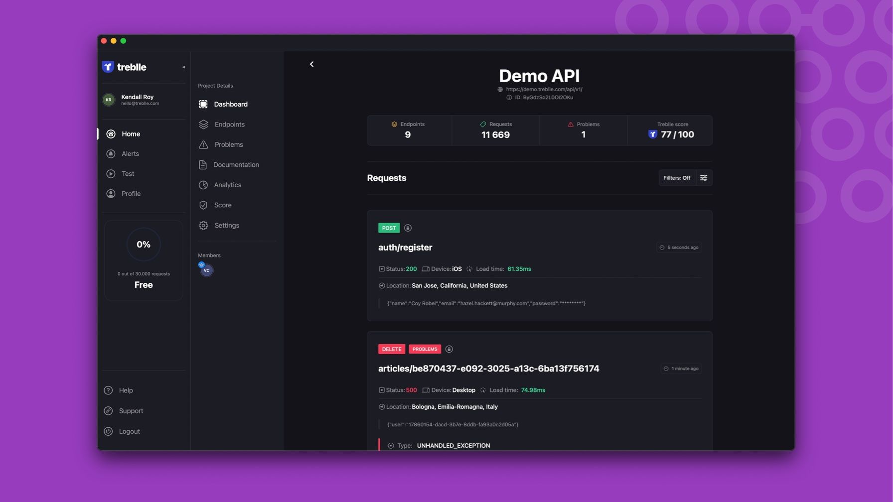
If I had to describe the Treblle app situation with one sentence I would definitely use the one we all know: "Third time's the charm" 😀 That's exactly what happened with our app. Unlike the 2 times before we actually had a company now, we raised our seed round in July of 2021. and we were totally focused on Treblle. We had two major goals for the first 6 months that we wanted to achieve. One, redesign our website and actually launch Treblle. Two, release our mobile apps. This time we approached things with a bit more planning but also with a more fine grained idea. So we know we wanted to cover all 3 platforms with one single app. That was for sure. We also knew that we wanted to have a testing suite in the Mac app so we don't have to use Postman anymore. We took that to the extreme and we asked ourselves how we can test from your iPhone without having to type anything in. Vedran came up with this idea of 1-click testing and said that we will add that as proof of concept to the website but ultimately we'll end up using it on the phone. We wanted the apps to cover everything from development to post-production and to provide value in every step of the way.
This time unlike before I had more experience in working with an all in one app and I've decided to use SwiftUI and Mac Catalyst to get the job done. SwiftUI has matured, there is a lot more content about it, tutorials, videos and articles. Mac Catalyst has on the other hand become quite popular, Apple is using it for it's apps and it actually works quite well. I think it boils down to having a great design that scales and choosing a navigation that works on all of the devices. We started working on a design that had built in dark mode and light mode. The design philosophy was that we would make everything as components and adjust them for each of the platforms in terms of the sizing as well as the amount of information you display. I think the design team, Darko and Dora, did a good job on that and we managed to get the design into a good shape which at the end of the day helped me out. We did make a few rookie mistakes when I look back at it. For an example, we left the indicator that shows you how many API calls you made this month in the sidebar area. That works for iPad and Mac but not for iPhone because there is no room for a sidebar 😀So we had to move that feature on the iPhone to your profile screen. But you can't predict everything 🙃
It took us roughly 4 months to build this version of the app from the design phase, API development to me finishing everything we set out to do. Was it challenging? Absolutely. We're a small but nimble team and I'm super proud of what we've done in such a short amount of time. The app we build works like a charm, consumes less than 50MB of RAM (unlike others) and looks great on all devices. It also comes with an amazing set of features that I'll briefly go over.
Features
Real-time API monitoring
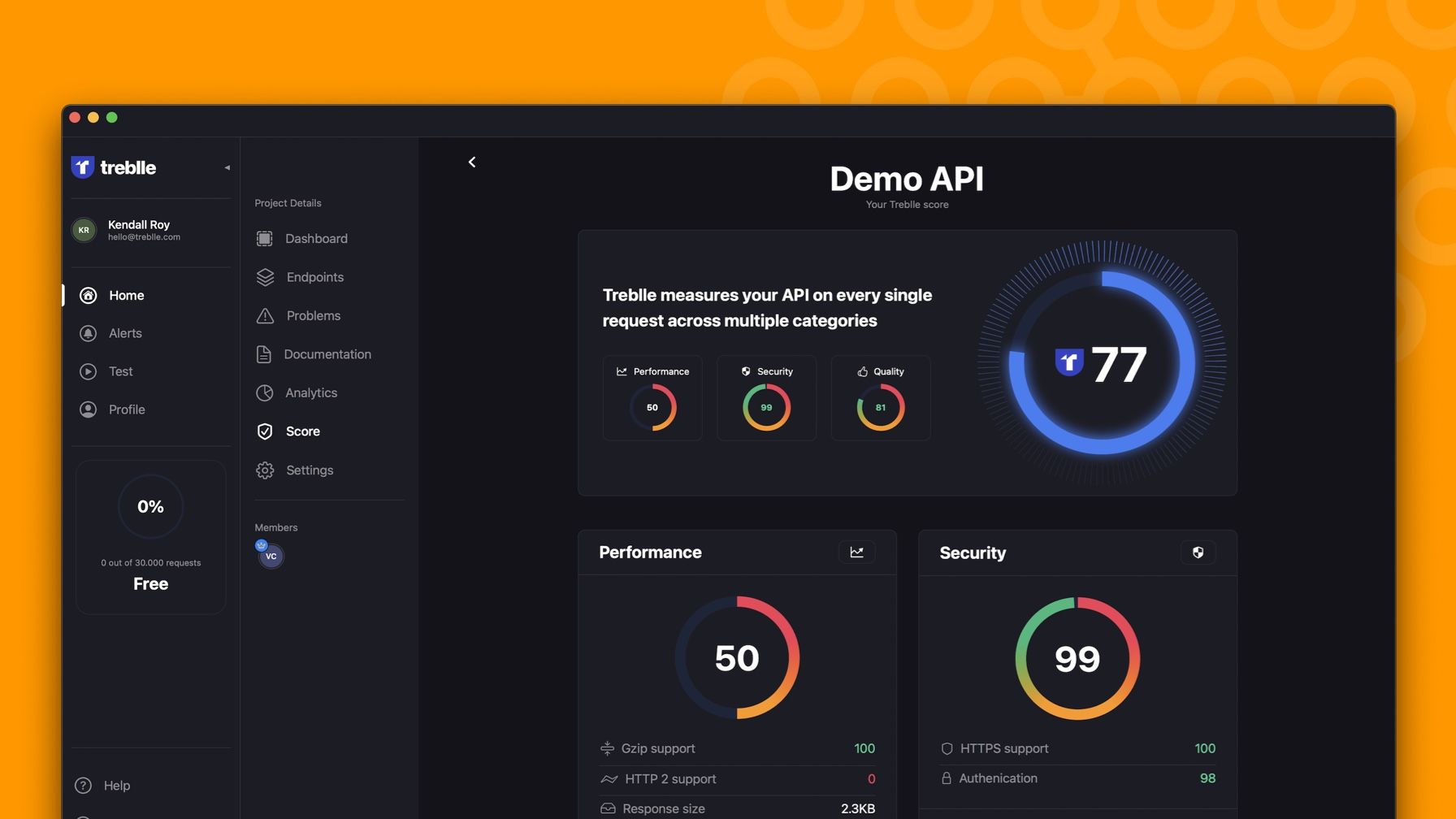
With the app you can monitor all your APIs from one place. We build a gorgeous dashboard that allows you to quickly see exactly what is going on with each of your APIs. We've built it so that anybody can understand it and you can simply open the app and glance at how all of your APIs are doing.
If you're interested in a specific API you can always open just that project in the app and see everything that's going on that project. When we say everything we do mean it. With the apps you have access to all requests others are making, API documentation, endpoints, API analytics, Treblle score and much more. For every single request you can view all the details you might be interested in like: request/response data, interactive location information, user data, server variables and much more. You can also filter and search the requests based on any criteria. So if you want to find all requests to the endpoints that registered users you can. You can even go further and specify a location, a user, a device or any of the data entries you see on your screen.
We've totally redesigned sections like API analytics and Treblle score. Both of them look really amazing and are filled with nice looking charts. This way you can quickly and easily understand things like API usage, analytics, devices, users and other API related stats. We've really stepped our game up on these and we will continue to do updates not just to the app but to the entire platform.
Alerts and notifications
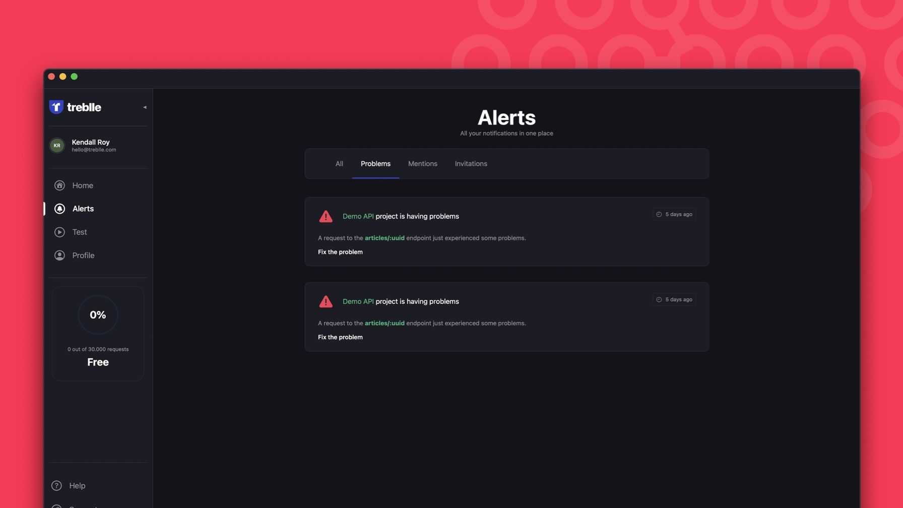
One of the core features of the app are the alerts combined with push notifications. Whenever something goes wrong on your API you'll be the first one to know, in real time. So once you do get a push notification we don't stop there. When you click on the notification we will take you to exactly that request which will show you all the information you might need like: error details, user details, device details, location and of course all the request and response data. This means you no longer have to wonder or guess or jump on your computer - you see all the information on any device. We're also very picky about how many of these we send you. So we will send you a push notification as soon as the problem happens. From there we'll keep count of how many times the problem has happened until you mark it as "closed". Once you do that if the problem happens again we'll automatically notify you. That way we don't spam you but you are still in the loop. We also won't send you both emails and push notifications. If you have our app we'll only send you the notifications so you don't get double alerted. Besides getting alerts for problems you also get alerted when someone mentions you in a comment or invites you to their project. So you can always stay in sync with your team.
Testing suite
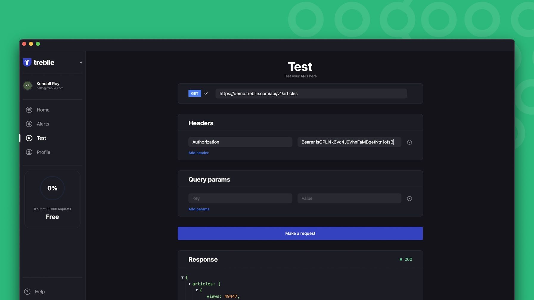
One of the most common use cases we wanted to cover was basic API testing. To do that you have to build an HTTP interface. So that's exactly what we did. Our super simple and easy to use interface is meant to allow you to quickly make HTTP requests to your API. We threw out all the complexities that many other tools have on purpose. We looked at our internal data and saw most people are actually using pretty standard HTTP methods and ways of authentication. We also plan to expand this section with suggestions based on the project you select. So with our next release you will be able to select a project, find an endpoint and we will populate the test data for you - all you need to do is select the variables. One important thing to note here is that if you make HTTP requests from our client they won't count against your plan 😀
Another really useful thing we added to make it even simpler to test on the phone is this notion of 1-click testing. Basically when you open any request in the Treblle app we make a button called "Run the test" and once you click it we'll make the same exact request for you. It's like a reply of the request. We know what needs to be sent, what data, what auth params...everything. We just do it for you. No questions asked 😀
Easy onboarding
When we completed the app we realized that many users will see a lot of empty screens after they download the app. It was bothering us a lot. We did design empty states with pretty graphics but still in order for people to SEE how great and awesome the apps are they would need to integrate Treblle into their own API. We've learned there are many, and I do mean many, reasons why people can't do that quickly so we wanted to help with that. To combat this we decided to build a real-life demo API and open source the codebase for it. Hence we created the Laravel API boilerplate which you can find right here: https://github.com/Treblle/laravel-api-boilerplate. After that we deployed a new microservice that essentially runs that code based and makes API requests to itself every 1 minute. Vedran took it to extremes and he actually randomized the requests so it's never the same request type, nor data. Once we had that in place we decided to add that project to you as a default. So when you register for an account, either on the app or on the web, we'll add you to that project automatically. You get to see the power of Treblle, it of course doesn't count against your plan and you can leave the project whenever you want.
That's all from me. I really hope you all like the app and that it will help you on your next API project. Personally I've spent a lot of time making sure things are perfect, fast, sleek and above all useful. If you have any questions, comments or anything similar feel free to ping me on my email [email protected] or on my LinkedIn page.
Oh yeah don't forget to test drive the apps by downloading them right here: https://apps.apple.com/hr/app/treblle/id1603233552

